
Digital
with Heart
Bringing Logix’s Banking with Heart to meet our members and prospects in the Digital World
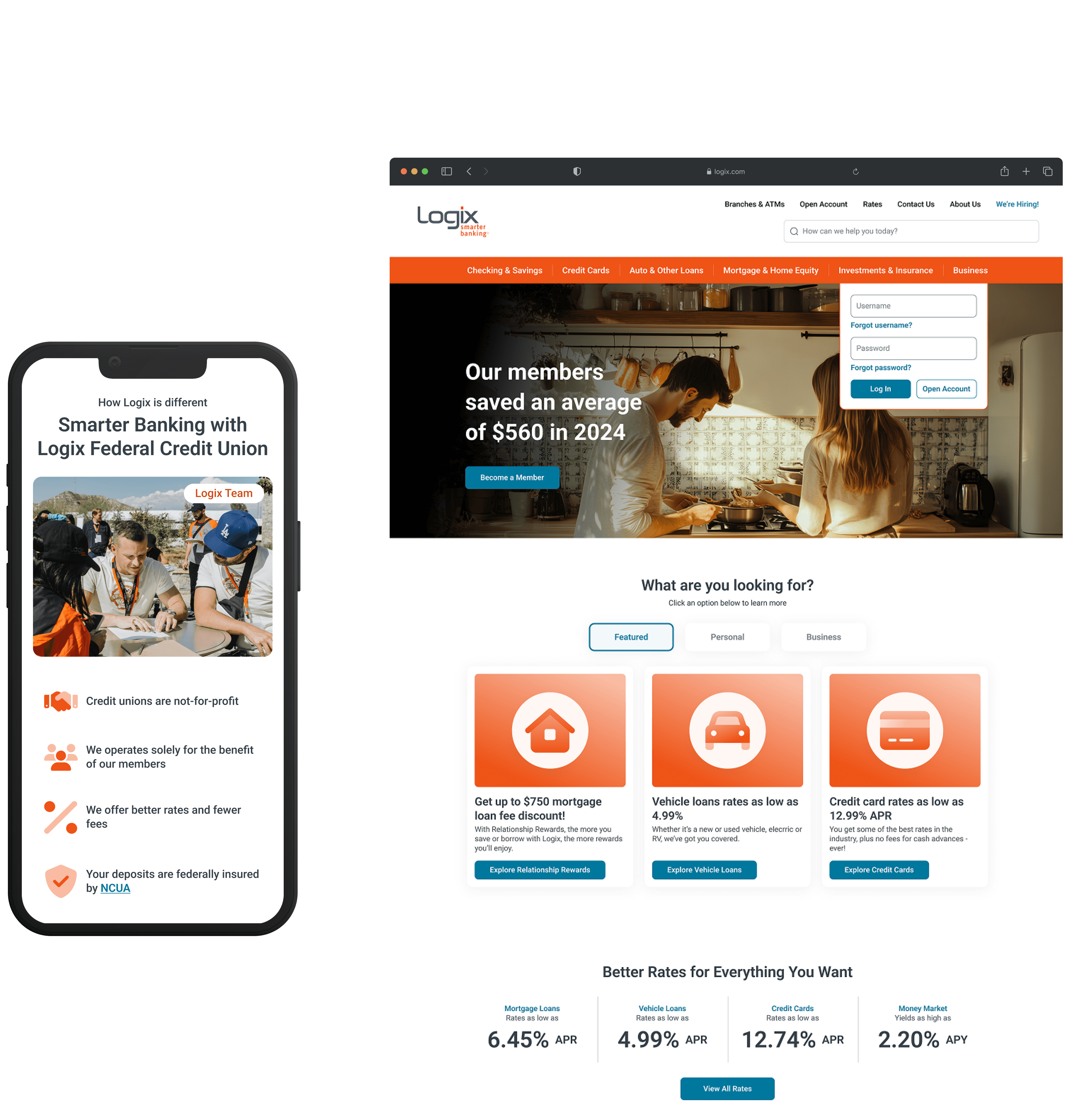
Type
UI/UX Design
Visual/Branding
Design System
User Testing
Date
Oct - Dec 2024
(14 weeks)
01. Problems & Goals
DESIGN PROBLEM
Logix aimed to drive digital traffic and reinforce a welcoming brand, but a cold interface, confusing navigation, and buried content left users feeling unsupported in key financial decisions.
As part of a broader business plan to modernize services and grow membership, Logix saw its website as a key driver of digital growth—but its cold, confusing experience undermined the brand and frustrated users. With a lean internal team, the goal was not just a redesign, but a scalable, easy-to-manage system that empowered marketing, ensured brand consistency, and delivered a clear, supportive user experience.
USER RESEARCH
Why this problem?
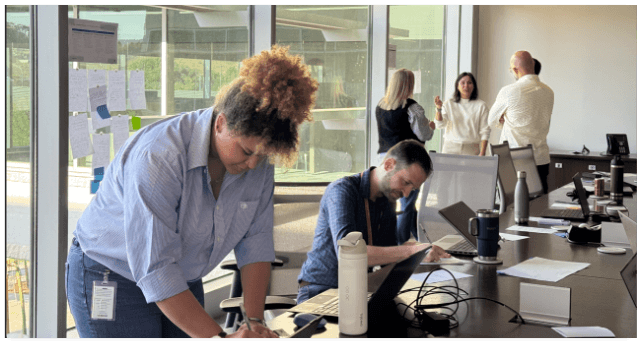
We conducted a comprehensive UX audit and engaged directly with users and stakeholders to uncover key issues:
Interviewed 32 customers and prospects to identify pain points and validate early ideas
Collaborated with 25+ stakeholders to align on goals, technical constraints, and content needs
Audited the existing UX to assess usability, navigation, and brand alignment

DESIGN CHALLENGE
How might we create a warm, user-friendly, and scalable digital experience that supports both users and internal teams while reflecting the Logix brand?
02. Design Principles
DESIGN PRINCIPLES
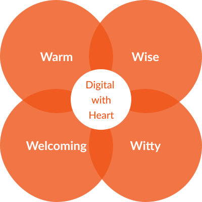
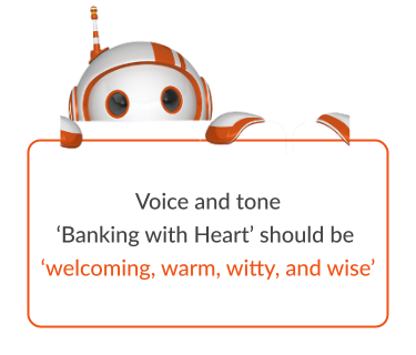
To bring "Digital with Heart" to life, we focused on designing for trust, simplicity, care, and personalization — creating an experience that feels warm, welcoming, witty, and wise at every touchpoint.
After understanding user pain points and needs, we conducted discovery workshops, heuristic evaluations, and competitive research to define what an ideal experience could look like—one that also aligned with the Logix brand. I led the development of four design principles that embodied “Digital with Heart.” These principles provided a clear foundation for the team and helped anchor design decisions in real user needs.
Four Design Principles to Help Thread ‘Heart’ Through Our Experience


A Clear Approach to Implementing 'Digital with Heart' Across the Website Flows
03. Approach & Framework
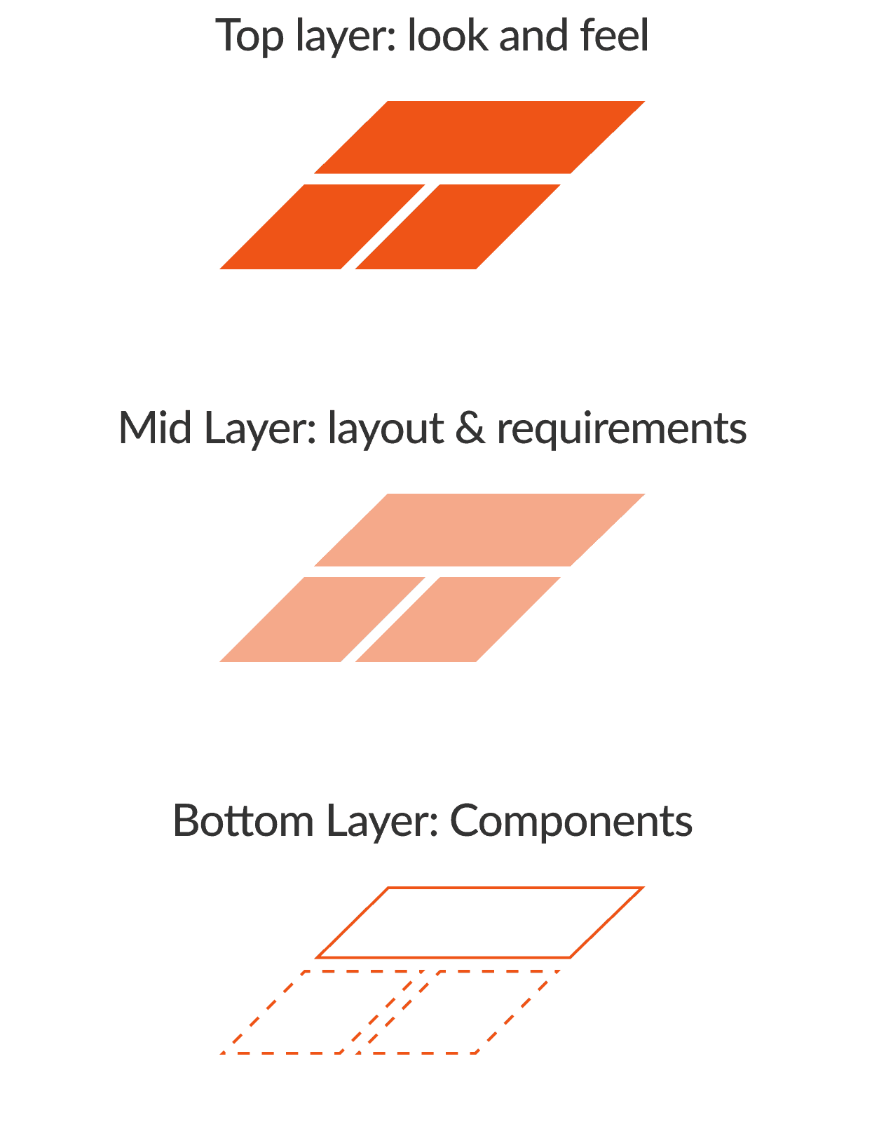
Since the Logix marketing team wasn’t familiar with design sprints, I established a clear, structured framework to keep them engaged and aligned throughout the process. I also introduced a component-first approach to address feasibility early on and ensure alignment with Sitecore constraints.
DESIGN SPRINT
Driving alignment and rapid iteration through collaborative, user-driven design cycles
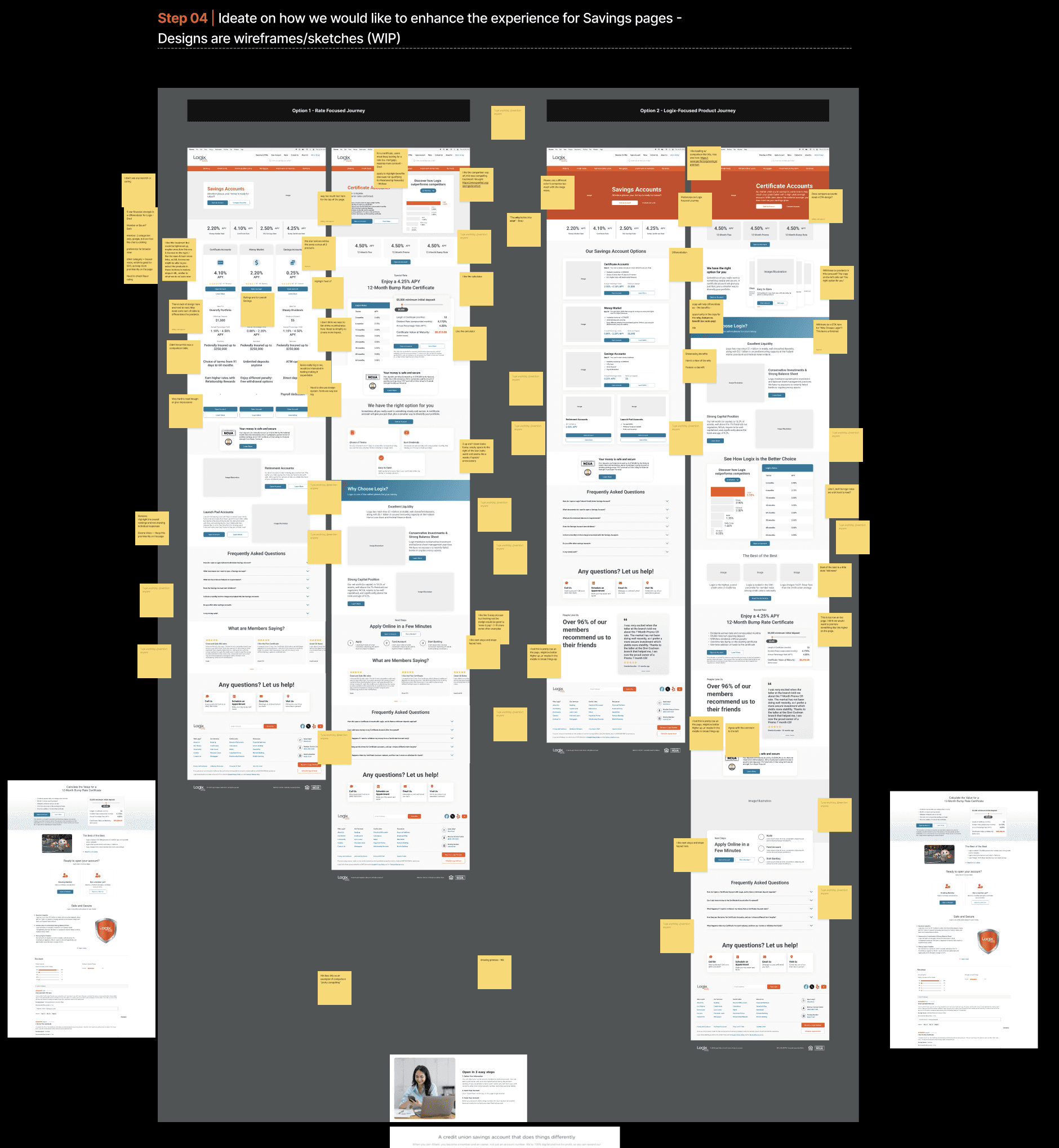
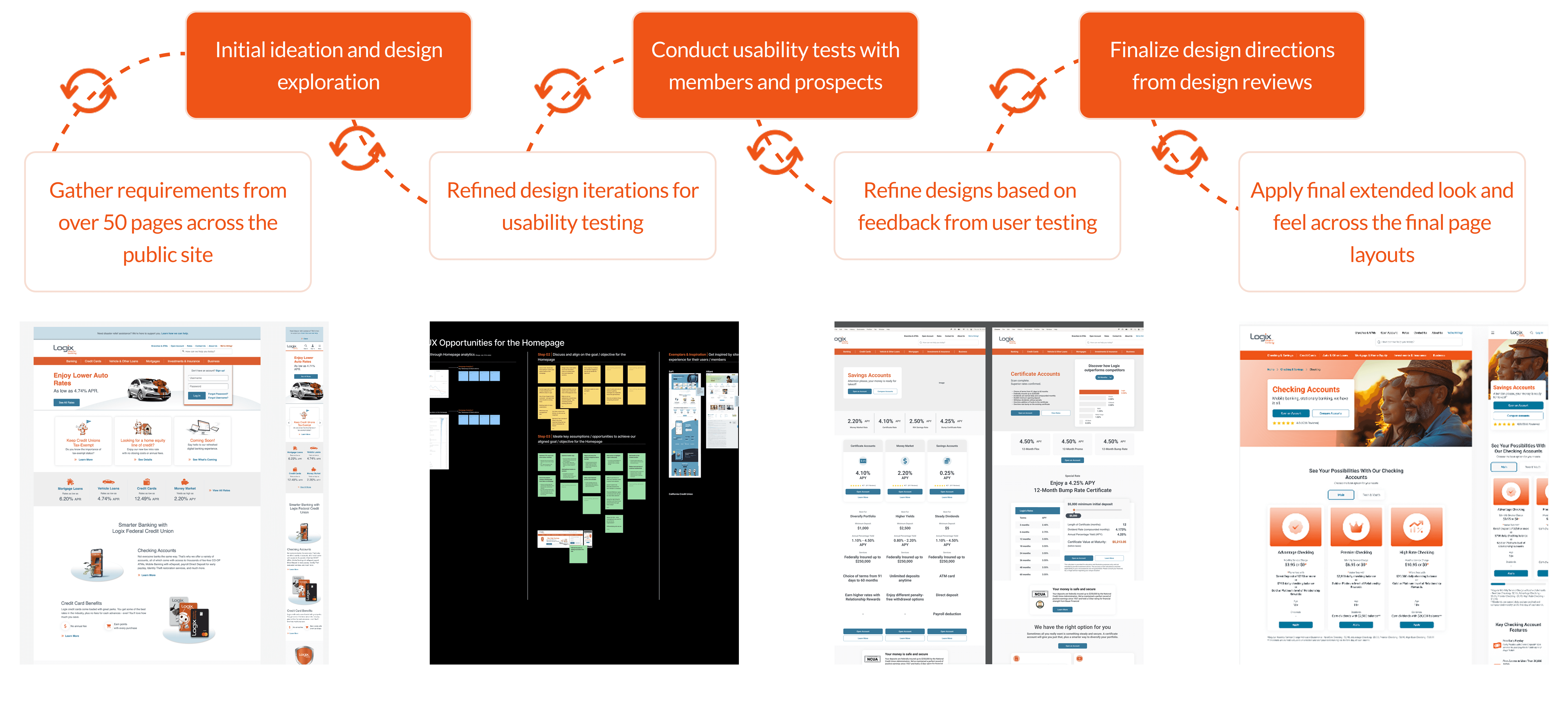
I dedicated 10 weeks to five design sprints—each focused on key pages over two-week cycles. In each sprint, I led UX audits, explored multiple design directions, conducted user testing via dscout, and refined solutions based on feedback. This approach ensured every page felt useful, intentional, and on-brand while fostering alignment among stakeholders.
WORKFLOW
COMPONENT-FIRST APPROACH
Component-first approach driving design growth, dev efficiency, and long-term scalability.
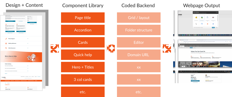
To kick off system design, we focused on key components for Home, Auto Loan, and Contact Us pages, then collaborated with engineers to build and test the Contact Us page in Sitecore. Early testing validated workflows, layout flexibility, and mobile performance, while I identified and resolved issues like missing variants and content overflow before scaling.
Example of Component Library
04. Test and Iterations
USER FEEDBACK & REVISIONS
Unmoderated testing for fast insights
I ran unmoderated tests on Dscout to observe how users interacted with key pages and tasks. This helped surface friction points, validate early design directions, and prioritize improvements—all without slowing down the sprint cycle.
Example Iterations Based on Test Feedback
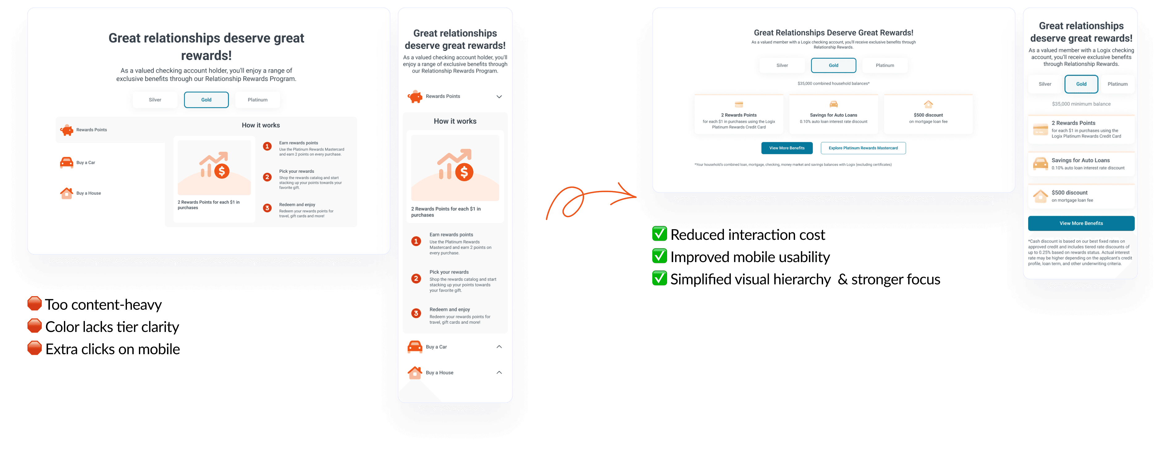
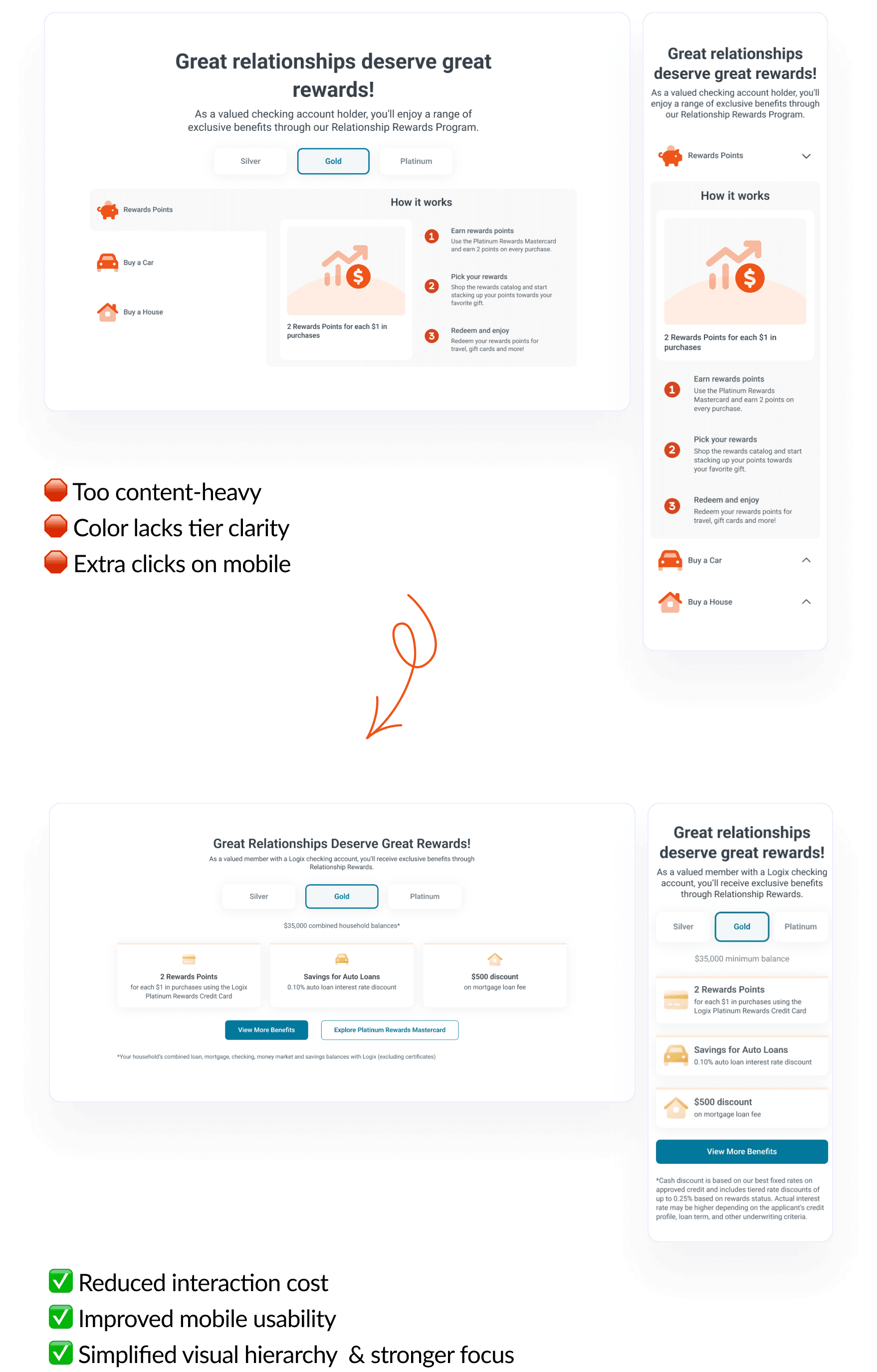
VISUAL DIRECTION TESTING
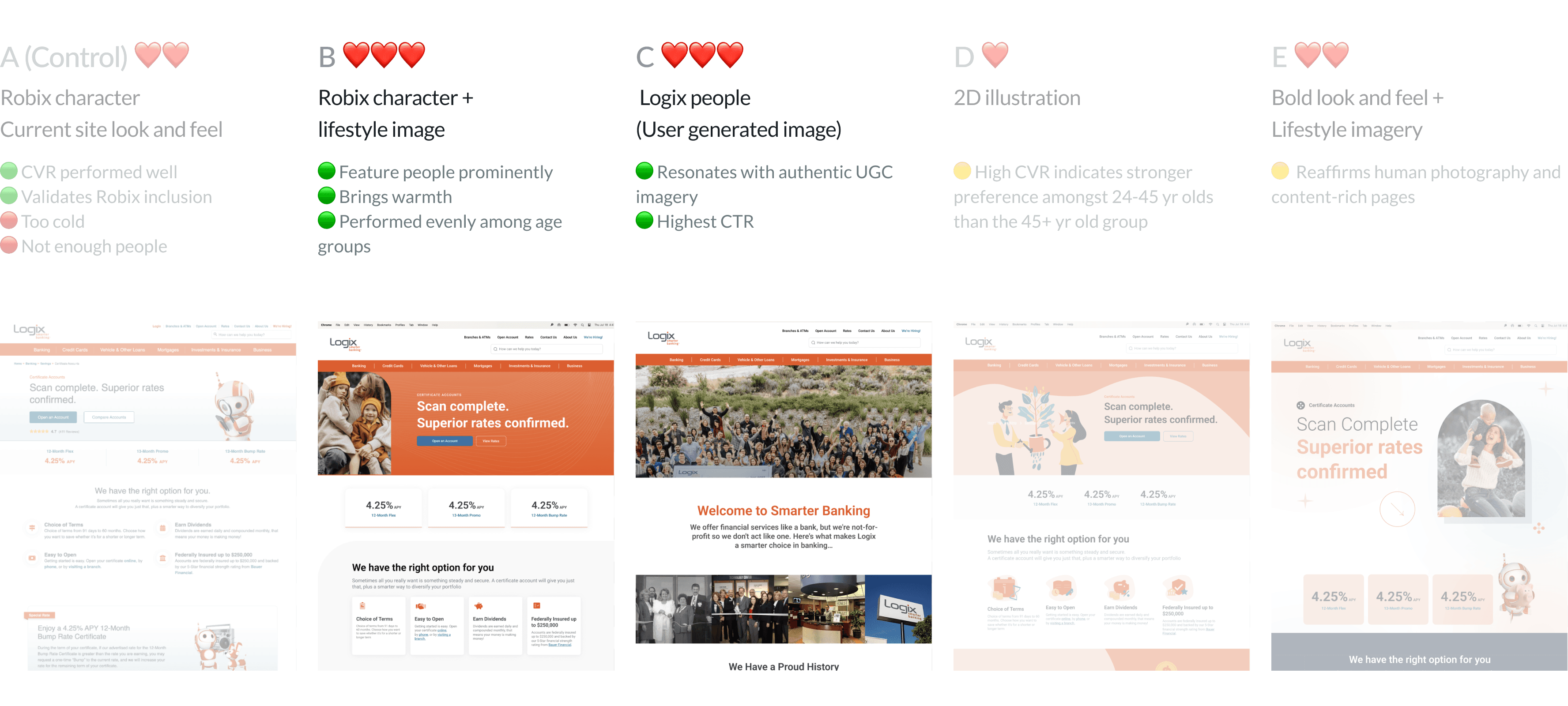
Market test to guide and validate image usage and visual style decisions
Aiming to reflect Logix’s warm and welcoming brand, I explored people-centered imagery to replace the previous cold, transactional visuals. We conducted a market test with 236 participants. It showed a 45% increase in perceived trustworthiness and a 38% lift in relatability when combining lifestyle photos with Robix and user-generated content.
05. Final Design
DESIGN FOR TRUST & TRANSPARENCY
Bring clarity into member benefits and application process
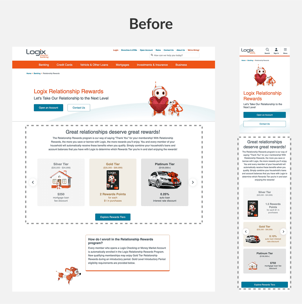
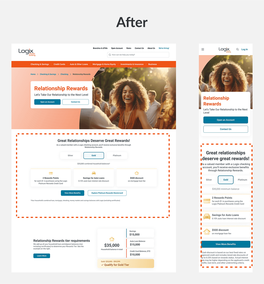
The previous Relationship Rewards tiers were static and unclear, so I designed interactive tabs for easy navigation and simplified the application flow, resulting in improved user understanding and confidence validated through user testing.
Created colored tabs to clarify member benefits by tier
Moved detailed application info to next step to reduce overwhelm

DESIGN FOR SIMPLICITY & CONVENIENCE
Create a clear and focused experience with a mobile-first approach
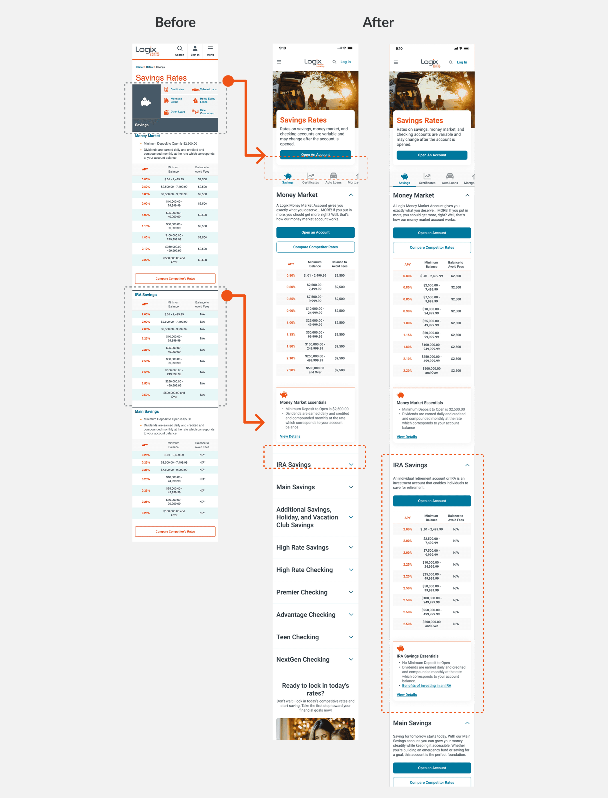
Usability testing revealed that the mobile rates page’s grid menu was overwhelming, so I redesigned it with horizontal scroll tabs and collapsible sections. This reduced clutter and improved navigation, leading to clearer task flows and fewer drop-offs.
Show clear breakdown and comparison
Reduce excessive scrolling by grouping details into collapsible sections
Create easy and organized paths
PERSONALIZE WITH PURPOSE
Ensure content is tailored to different levels of financial literacy
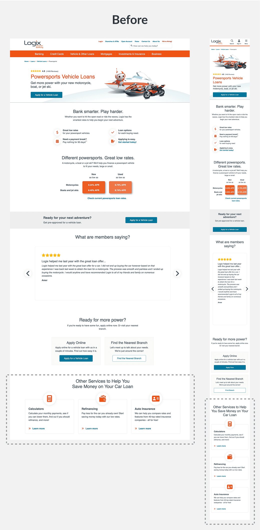
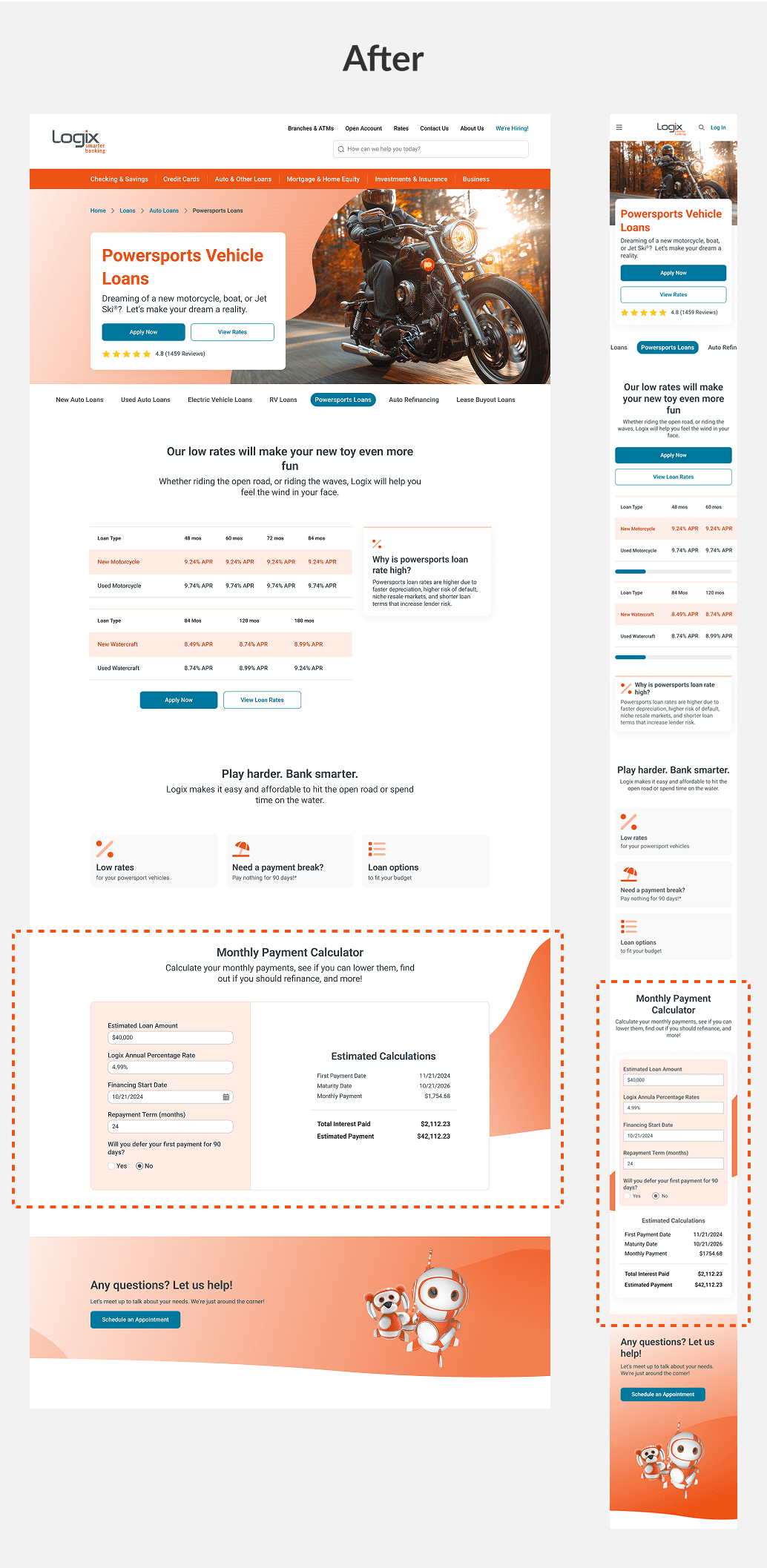
67% users struggled with costs on the powersports loan page in user tests, so I replaced a static FAQ link with an integrated cost calculator, helping users get quick estimates and make decisions confidently within the flow.
Provide important information upfront for all users
Introduce resources and financial tools for novices

06. Hand-off
To ensure a smooth transition from design to development—and long-term success for the Logix team—I structured a thoughtful hand-off process that balanced system scalability, technical feasibility, and day-to-day usability. This included a robust design system, detailed documentation, and close collaboration with engineers every step of the way.
SCALABLE FOUNDATION
Design system organized for clarity, built for reuse
Design system with clear naming conventions and component variants makes it easy for engineers to track variations and for client team to reuse them confidently in Figma and Sitecore. This modular approach reduced confusion, improved collaboration, and laid the foundation for a scalable, flexible CMS experience.
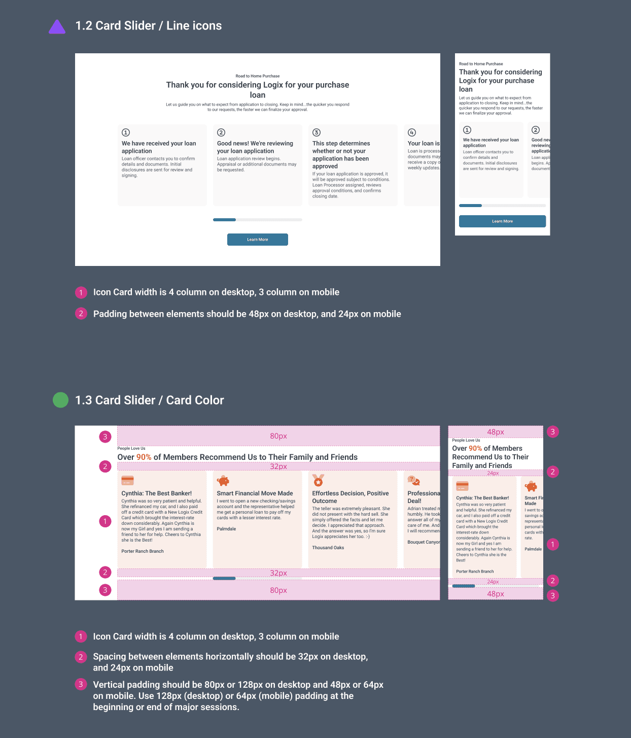
EFFICIENT DESIGN HANDOFF
Clickable Prototype + Annotations
Beyond the design library, I created a clickable prototype with detailed page-level documentation and annotations. This helped engineers implement designs accurately and reduced QA cycles. The annotated handoff became a shared reference point, enabling smooth collaboration and faster development.
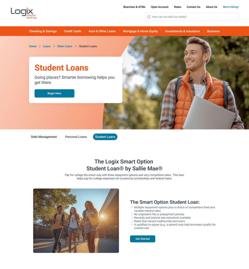
IMAGE USAGE GUIDELINES
Clear image usage guidelines for cohesive and impactful visual storytelling.
To ensure the client team uses images intentionally post-handoff, I prepared detailed image usage guidelines with examples alongside design principles and style guides. This foundation guided the selection of hundreds of images, fostering a human-centered, consistent brand experience that resonates with both members and prospects.

07. Takeaways
On the Logix website redesign, I supported creating a scalable, easy-to-manage system that empowers marketing, ensures brand consistency, and delivers a clear, user-focused experience. By combining user insights, business goals, and collaboration with clients and engineers, I helped deliver a human-centered design system supporting both customers and internal teams.
This project taught me the balance between brand voice and usability, designing for flexibility, and navigating technical constraints. It also reinforced how small design choices—adding clarity, warmth, or helpful interactions—build trust and connection over time.

Thanks for reading and being part of this journey—where digital meets heart.
How might we empower change managers to drive AI adoption through real-time insights, smart automation, and evidence-based interventions?
